BlogRoll
Links
GoogleAardvark
Scoop
Arts & Letters
Bloglines Blogroll feed currently *broken*
Subscribe to
Posts [Atom]bloglines
A place of Bile & other Humours.
BlogRoll
Bloglines Blogroll feed currently *broken*
Subscribe to
Posts [Atom]bloglines

1 Comments:
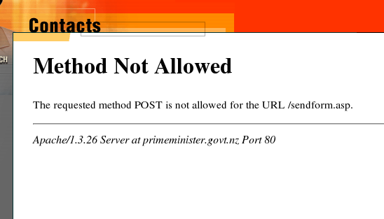
They haven't even redesigned the site in seven years or so. Sad.
Post a Comment
Back to Jonathan's Liverstone